We have a winner!
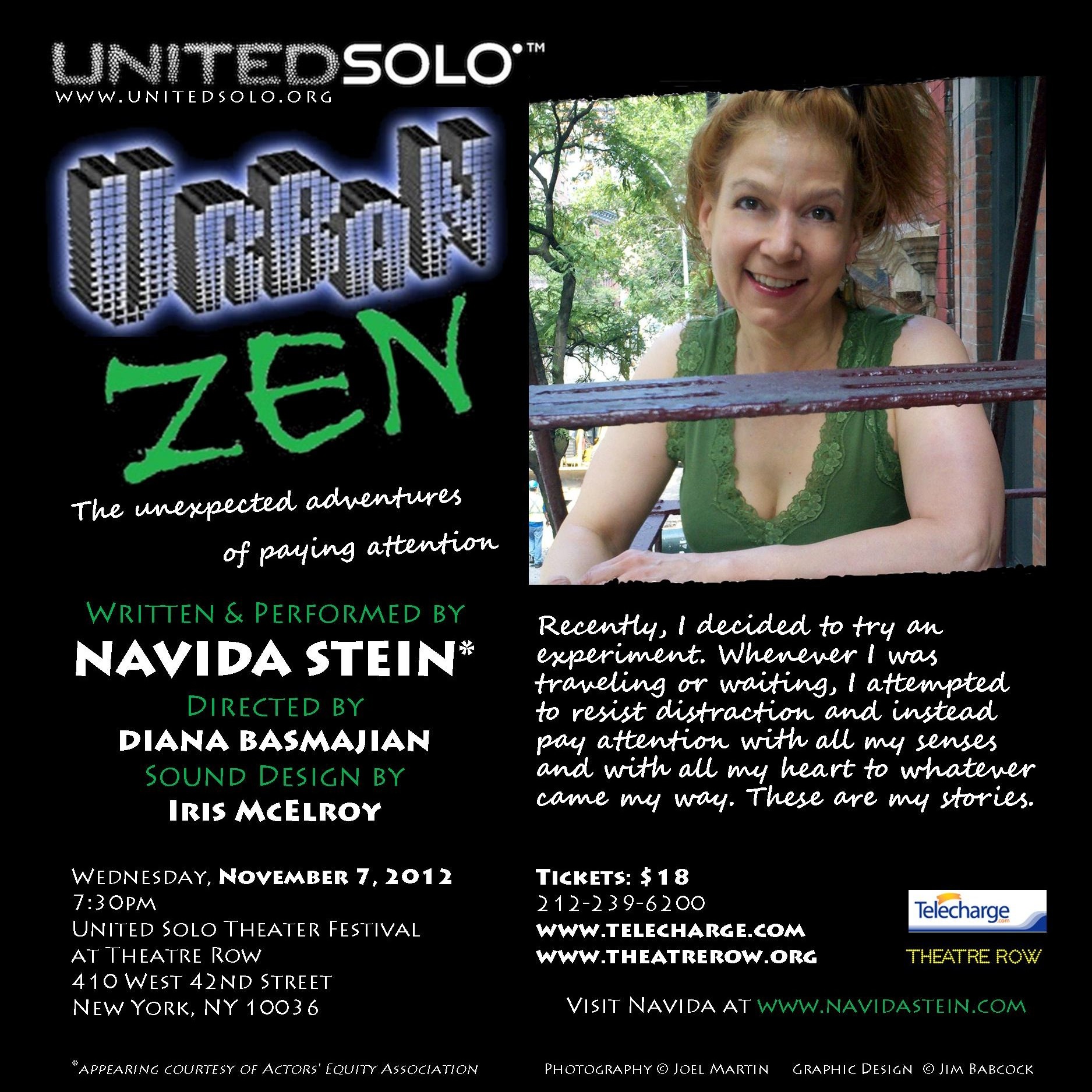
After finally selecting the right font for Zen (I think we went through 10 samples), it was pretty easy to piece it all together. The ‘skyscraper’ font was used for Urban, representing the glass and concrete canyon that is New York. The client specifically wanted a brush or pen stroke for Zen to complement the hardlines above. The green from her blouse was carried over into the copy as an accent. The torn picture effect happened naturally, as the steps of the fire escape created an angled and jagged effect at the bottom of the picture. I edited the top to mirror the angle and jag. I hope her show does well and sells out. [Note to self: Always make sure to verify the URLs are typed correctly and work. Always!]
[Update October 03] The show is sold out! Congratulations, Navida!
[Update November 07] Although the effects of SuperStorm Sandy were still being felt around the city, the show went on, and the house was filled to capacity. Only a few seats were empty, attributed to the transportation challenges.
Title fonts: Delusion, Scratch
Front text fonts: Lithographlight, Segoe Script
Back text fonts: Lithograph, Lithographlight
Leave a Reply